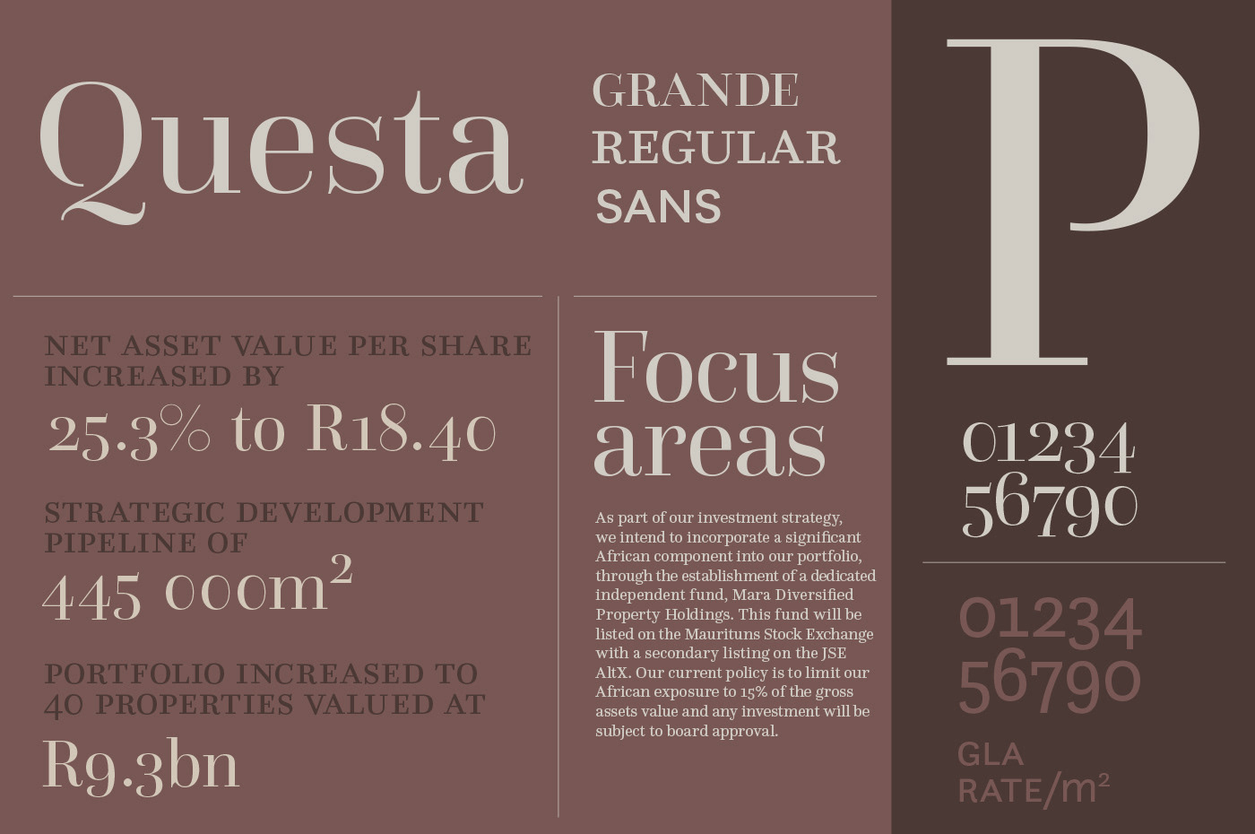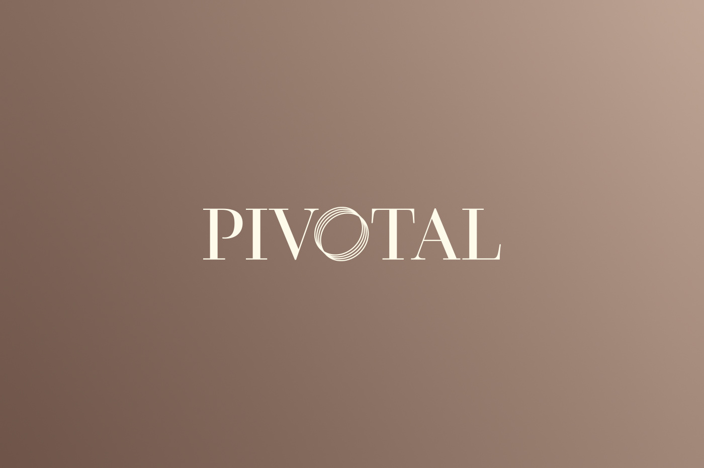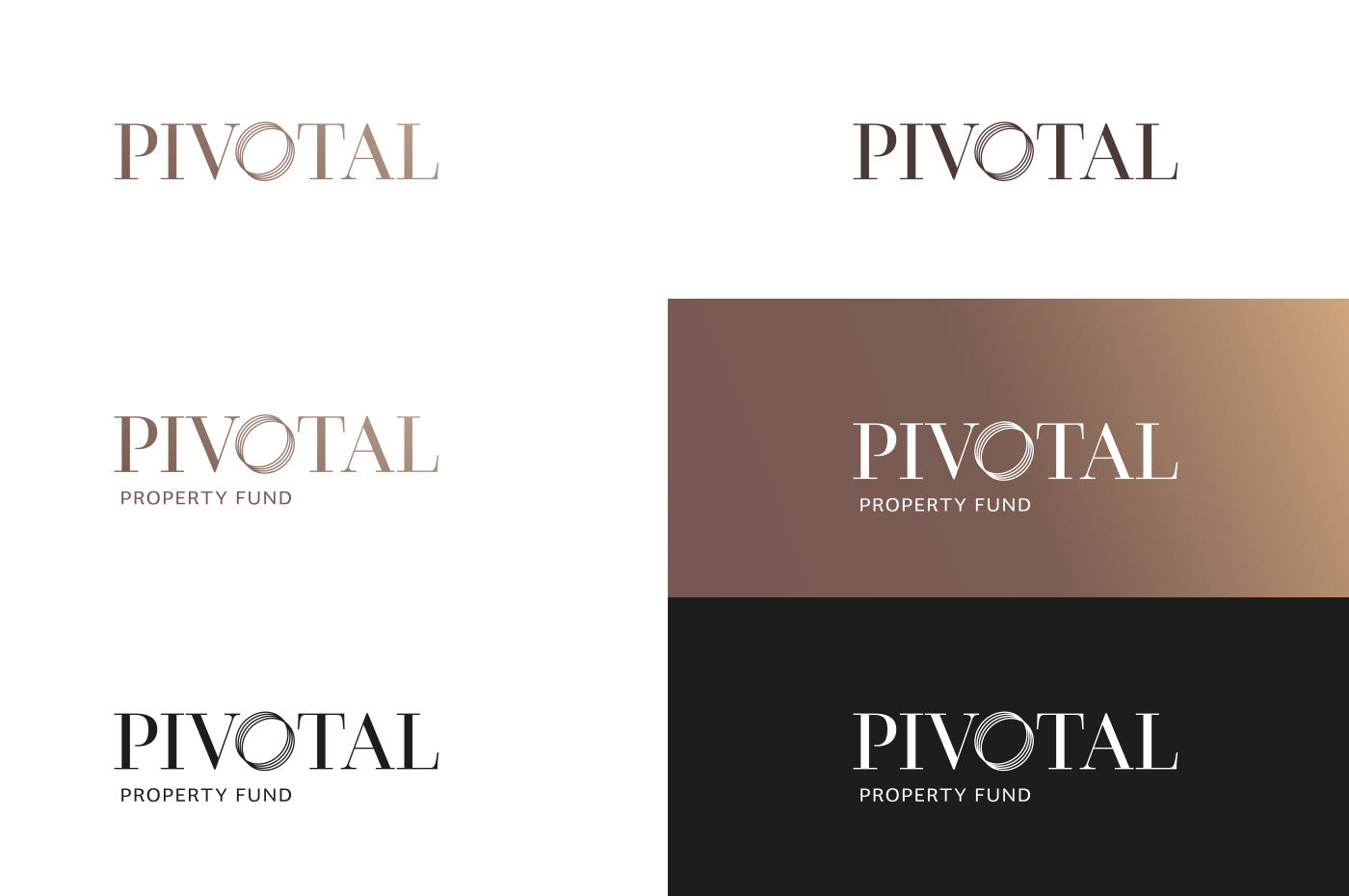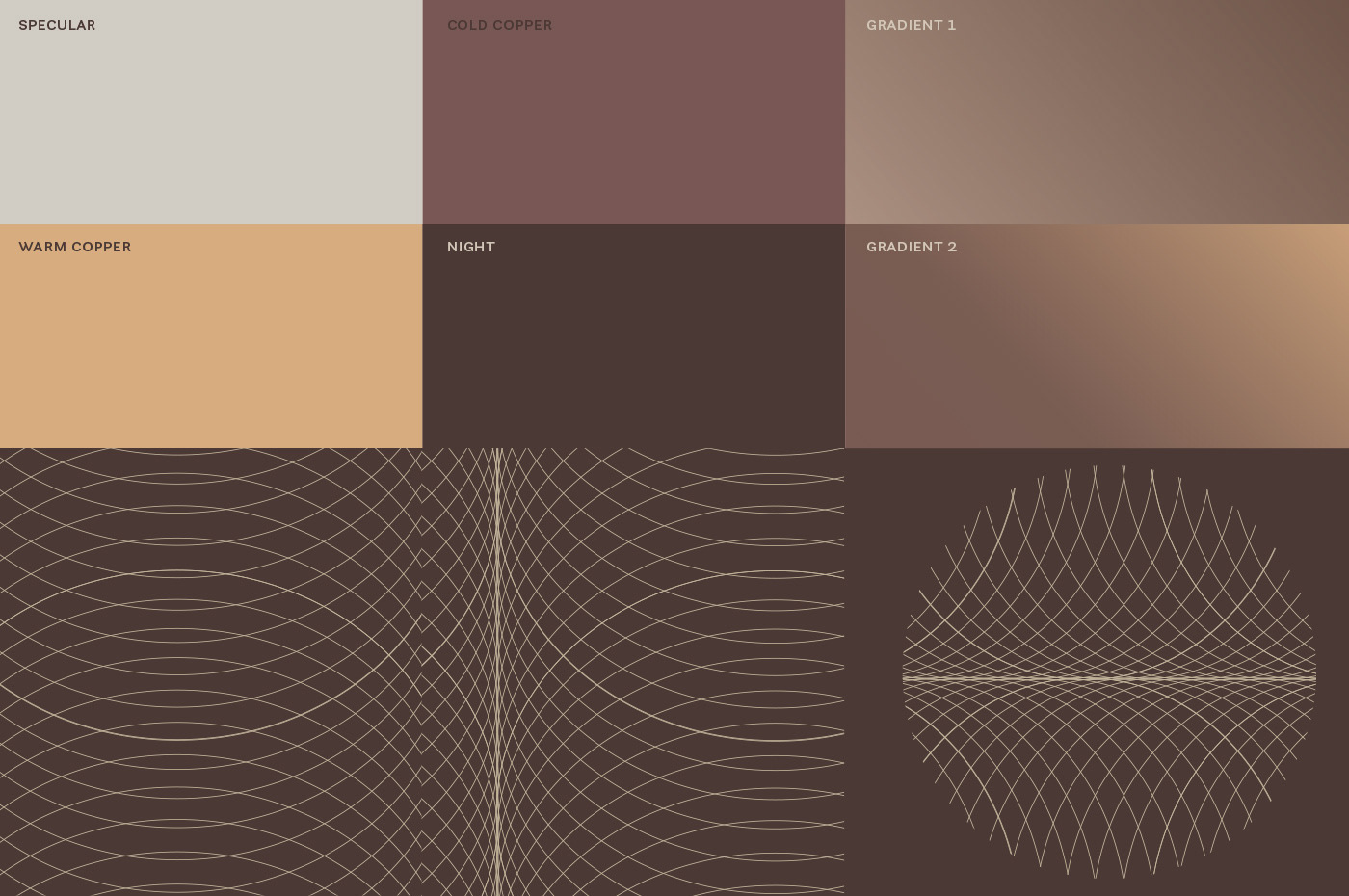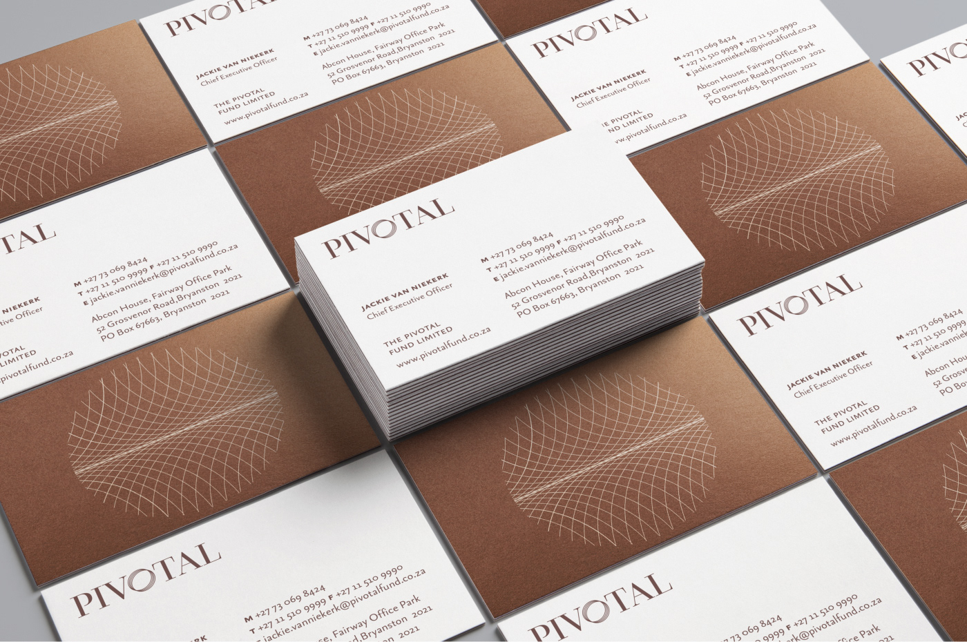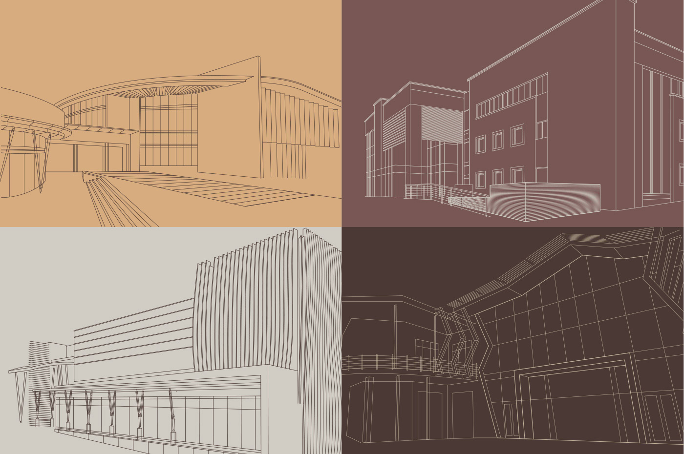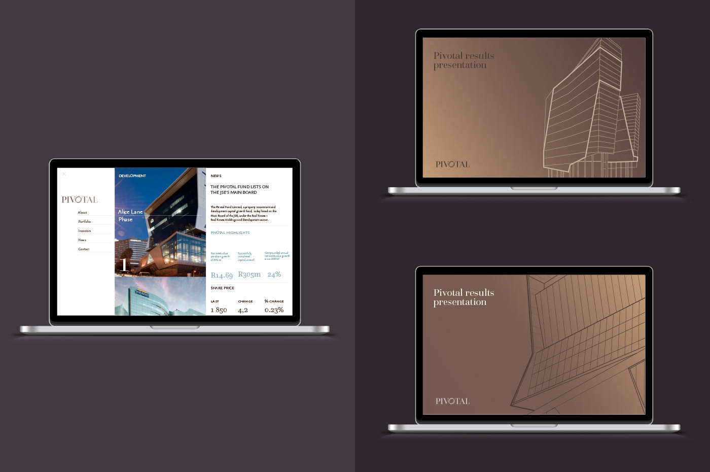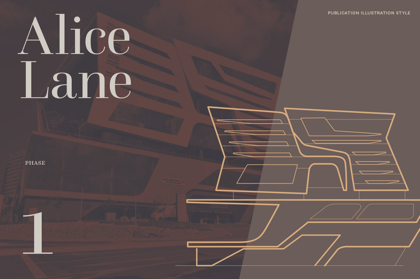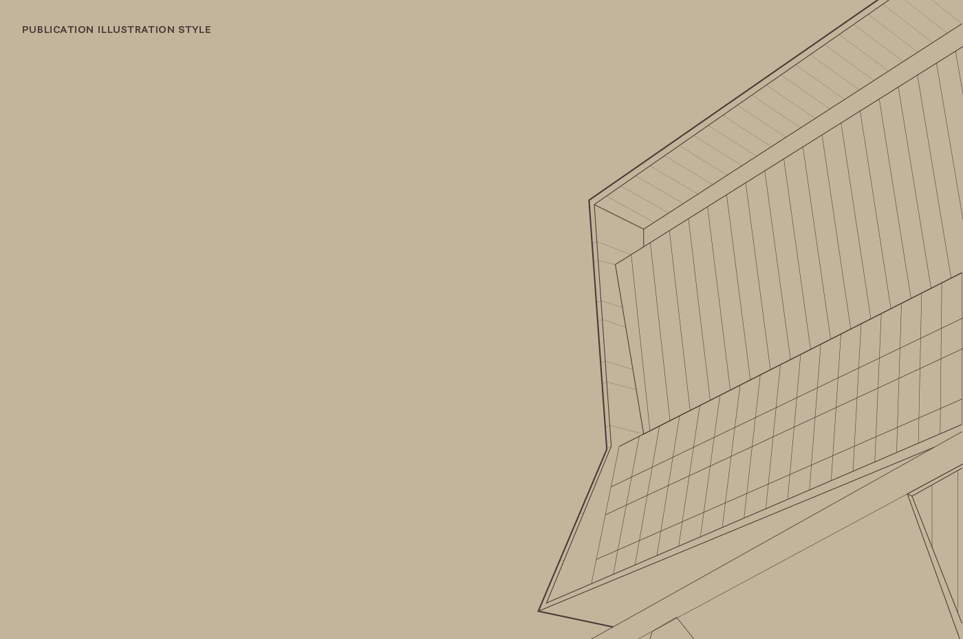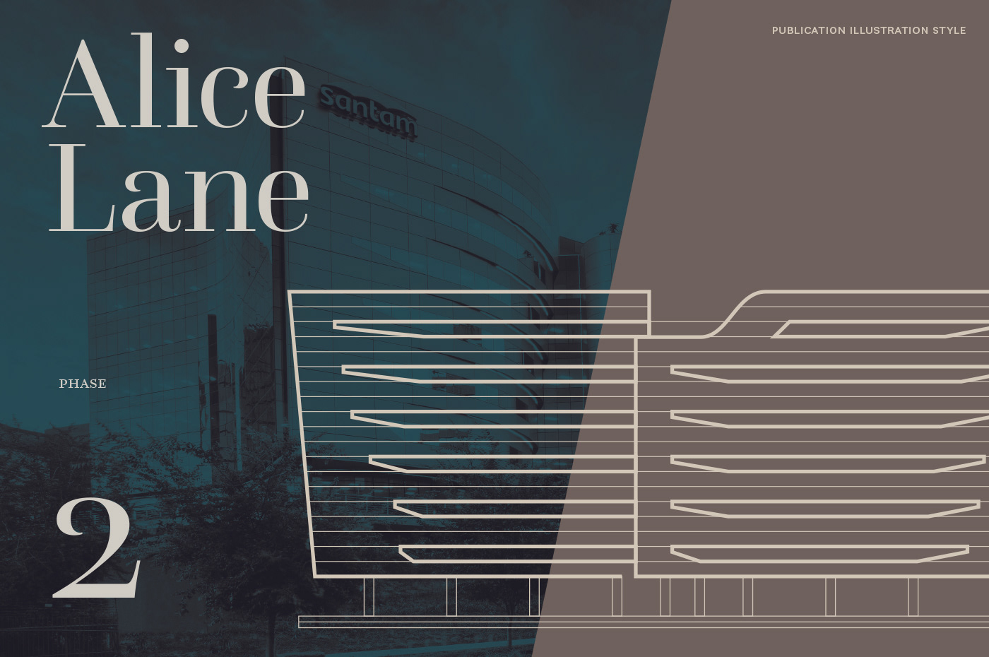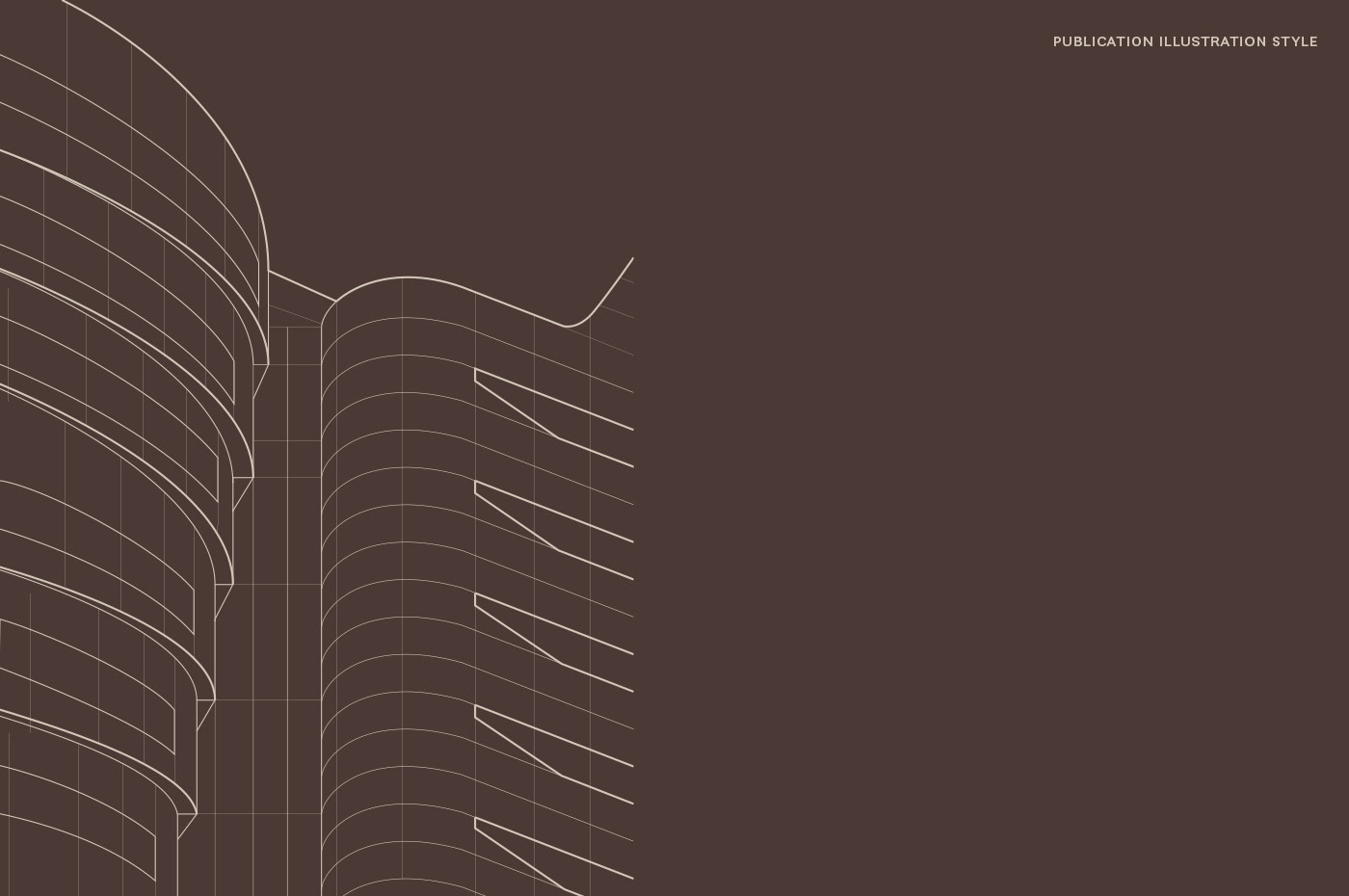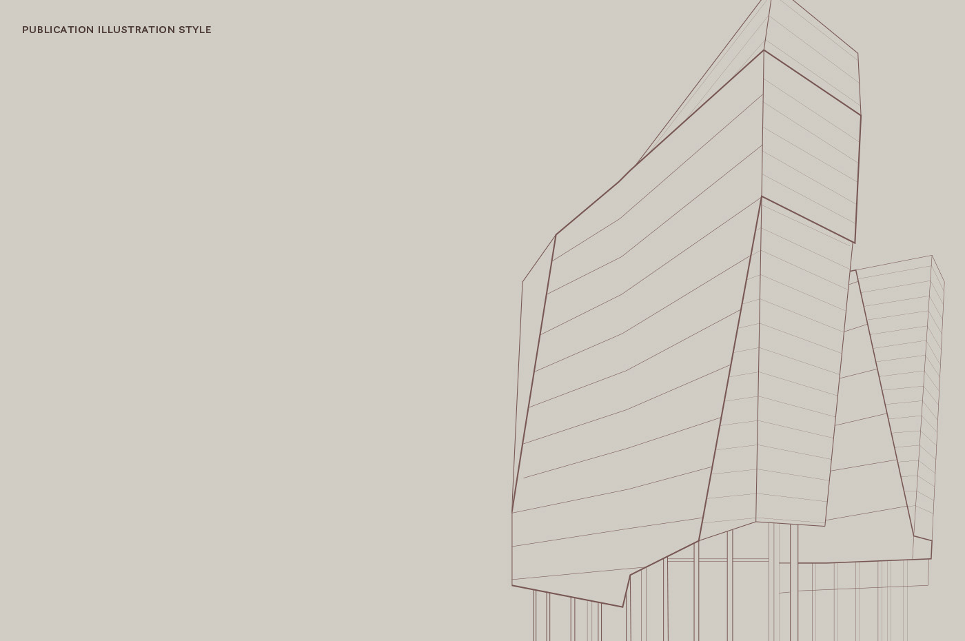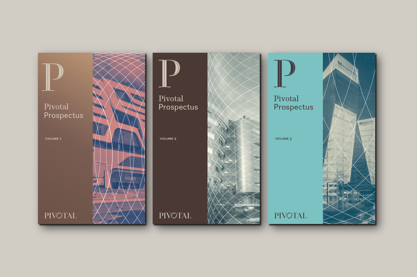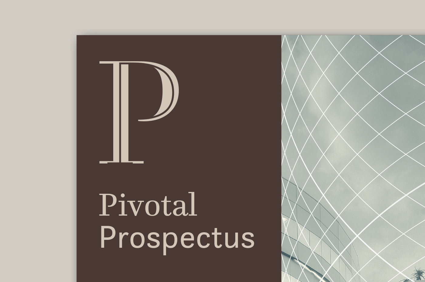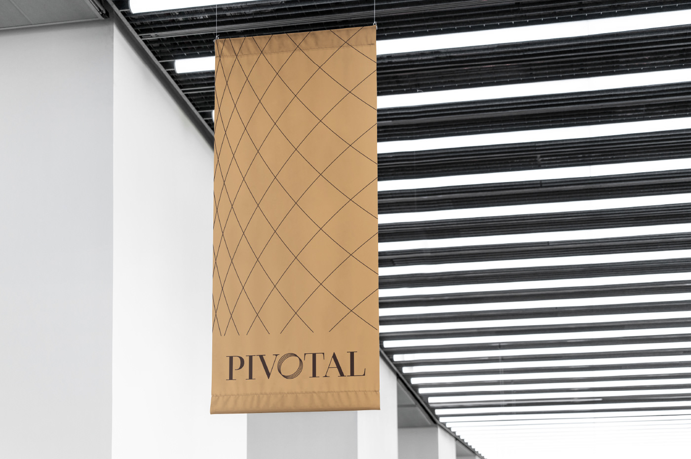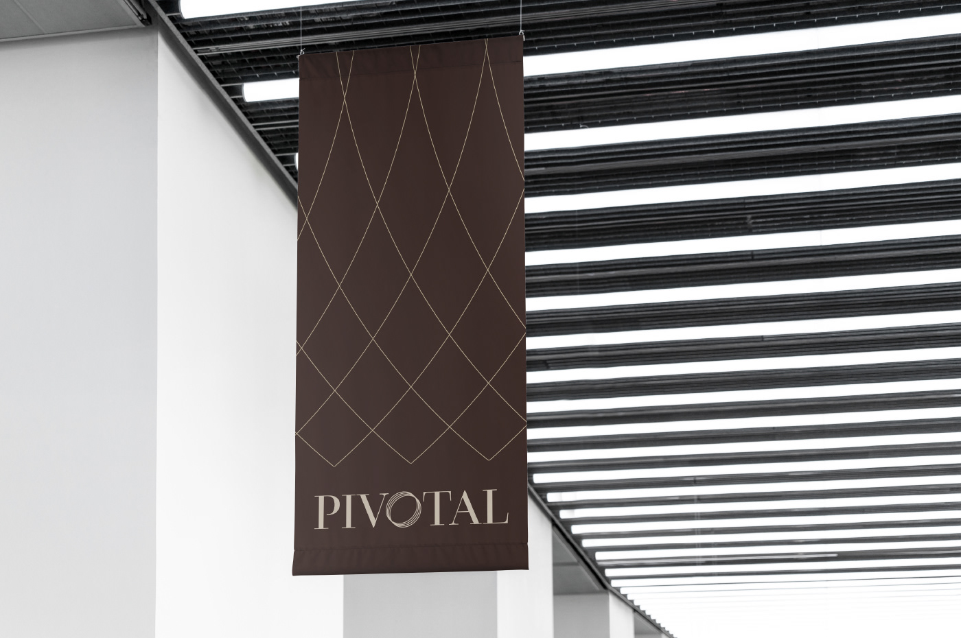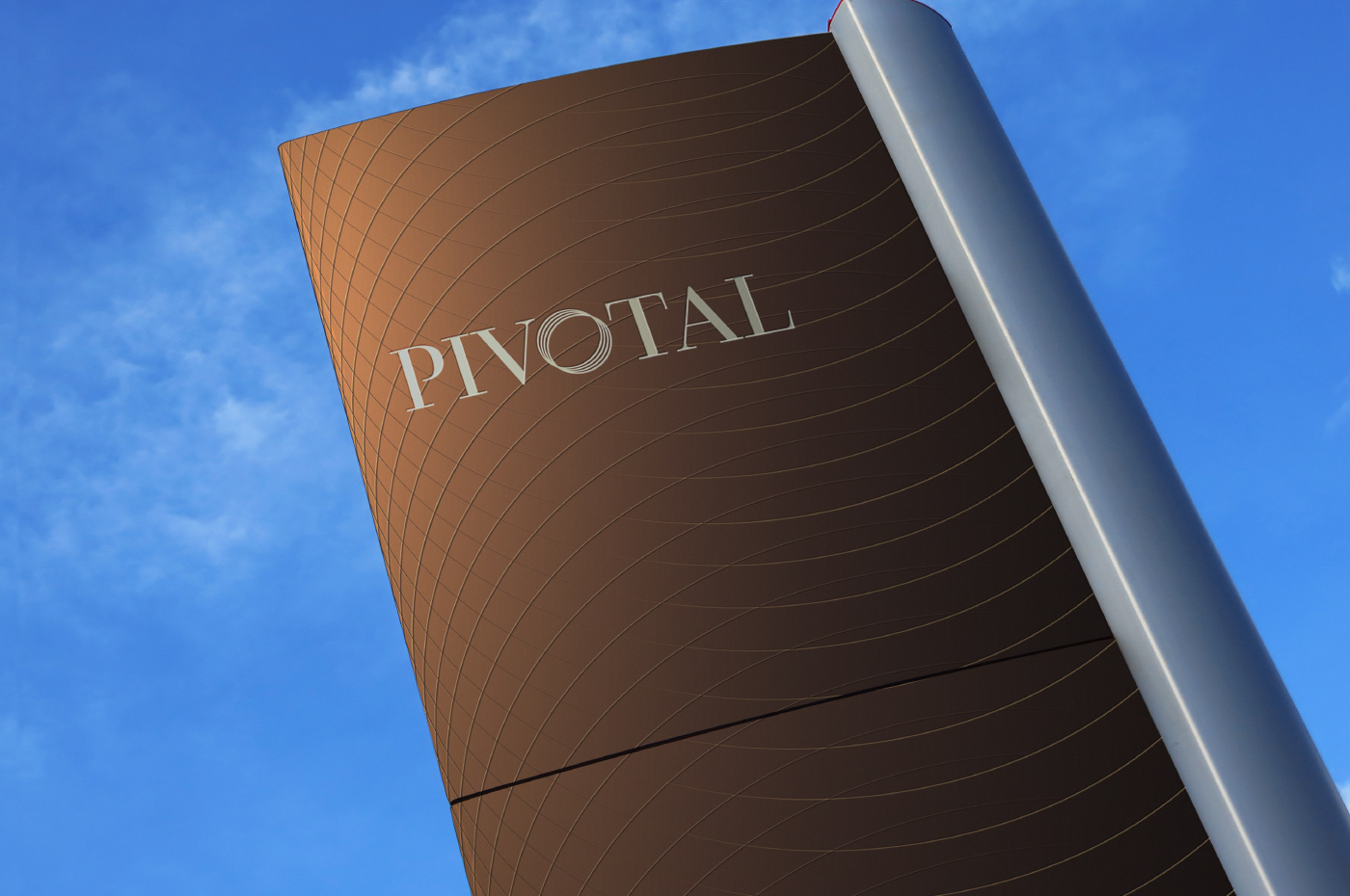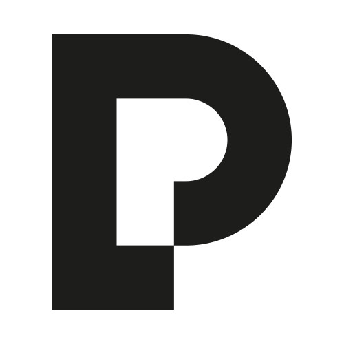
Evolutionary re-branding of a property fund company. The challenge was to keep the "iconic" pivoting letter "o" and convey it in a more contemporary and visually appealing way. A newly developed visual language was created with the new symbol in mind, to further expand the presence of the brand.